
Wednesday, February 26, 2020
Hockney
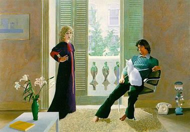
Mr and Mrs Clark and Percy by David Hockney
I really found this painting interesting because of the body language of the individuals and also the placement of certain objects. For example, the telephone is placed on the carpet next to the man. I also find the body position of the man to be unique, as he also appears barefoot. He also seems to be more affectionate towards the cat than the woman, who looks stern.
David Hockney- Christina Dean

Hockney

This painting is a Tea painting by David Hockney. This painting was created in 1961. This is not one of his typical paintings as this painting is as close to pop art as his work ever gets. It’s painted in a way that gives it dimension and character. In the future, I would like to create abstract art like this.
David Hockney

The reason I picked this David Hockney "Pool with Two Figures" is because of the light tones implemented in the pool and also the background of the mountains. Overall I feel like the picture has an amazing use of bright colors mixed together well which is why I was drawn to this painting
"Garden with Blue Terrace" by David Hockney

David Hockney

David Hockney

David Hockney is an English painter, born in 1937 who gained popularity during the 1960s for his paintings of swimming pools. Hockney is most known for the vibrant color which he employs in his pieces, this portrait of his mother or Mum from 1989 is no exception. The way he includes so much color in the skin such as the pink, green, and blue give so much more life to the piece without there necessarily being so much shadow. I also enjoy the attention he gives to the skins texture as well as the texture he creates within her hair. The most eye-catching part of his piece is her eyes, they're piercing yet are not overpowering because of the inclusion of color throughout the rest of the painting .The way Hockney truly understands color is speaks to his skill as an artist and set him apart from other modernist painters.
David Hockney

In 2007, David Hockney created this painting called "Bigger Trees Near Warter." Hockney created this oil painting using 50 smaller canvas's when put together create one large painting. I like how simple this painting is and also how the trees are bare so you can see through towards the back of the painting which provides depth. I also liked that even though the trees don't provide much color, the greenery and the houses surrounding the trees do. Hockney contributed to the pop art movement but his art displays expressionist elements. He also created portraits, photo collages and print making.
David Hockney- "Garrowby Hill"


David Hockney is a 82 year old British painter draftsman, print maker, stage designer and photographer. The photo I chose created by David Hockney is called "People like pictures... They don't go away" I chose this painting because I noticed that a lot of his art work is very realistic but not detailed and this one is very detailed. I feel like it is a good representation of how Hockney is a man of many talents. He is capable of creating a detailed painting if he wants and is also has capabilities is other areas of art.
My Parents - David Hockney

The photo I chose is My Parents by David Hockney. This painting was created in 1977, and it's medium is oil paint on canvas. He did have an early draft of this painting before he released it to the public but he abandoned it. He was originally going to put a self portrait in the mirror but he didn't. He painted from life but also used many photos that he probably took himself for reference. I like the colors he used in the painting they are calming yet intense because of the burst of yellows and reds from the flowers. Also, I found it interesting that in the mirror there are two paintings (creating a triptych). The first painting is The Baptism of Christ by Piero Della Francesca (I thought this was a funny coincidence because we had previously done a blog post on him). The second painting that is barely shown in the mirror is one of his own painting's called Invented Man revealing Still Life.
Tuesday, February 25, 2020
Yellow Tulips- David Hockney

Monday, February 24, 2020
David Hockney

This piece of artwork is called Mulholland Drive: The Road to the Studio. Hockney created this acrylic painting in the 1980's. I picked this painting because I love the vibrant colors. The way he uses this colors makes us look all over the painting. This painting almost looks childlike but with all the details you can tell a child did not paint this.
Thursday, February 20, 2020
Luca Signorelli
The reason I choose this Luca Signorelli picture is that if the color from the sky mixing well with the other earth/human tones within this painting. Signorelli does an amazing job creating paintings that tell the story of the bible and be used to help people understand more visually what happened during that time period. I really did enjoy looking. I also loved the detail in clothing, the building in the background, and the trees.
Edward Hopper

The reason I choose this Edward Hopper artwork is for many reasons. The main reason is that I actually had this painting growing up in my old house. I was always attracted to the man sitting alone on the left and wondering what he was doing in the painting. I was also attracted to the time and late-night environment going on within this painting. I never knew it was an Edward Hopper painting until having to do research on his artworks. I would love to draw something in a night time setting such as this one within the near future.
Sol Lewitt
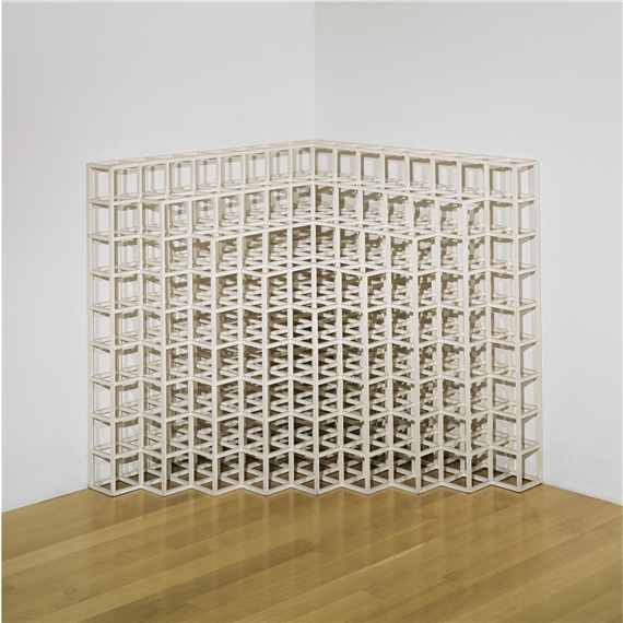
I found myself drawn to this Sol Lewitt artwork because I truly find it simple, while also very detailed and complex. There is not much color going on in this piece other than the wall and wood shown in the picture. However, the pattern created by the stacked cubes, makes this artwork hard for me to stop looking at. I would love to attempt something similar to this with my own art
Wednesday, February 19, 2020
Edward Hopper- A Room in New York

Edward hopper

This piece of artwork is called “Central Park”. This painting captures the calm side of New York City. I like this painting because he took a different approach to painting New York, he chose a sunset with no traffic or people in the background to show the beauty of this city when it is completely quiet. I also like the amount of attention he paid to small details in this painting.
Edward Hopper


These are works by Edward Hopper. Edward Hopper was known for his vision of reality and his landscapes. He was born in New York in a middle class family. I chose this image because it reminded me of the TV show Bates Motel. When researching I learned that the house Hopper had created was later used as a inspiration for the Bates Mansion in the film Psycho. The house represented in these paintings were bought by General Thomas Gagan in 1919 located in Rockland County. I like how mysterious this Victorian mansion looks and seeing the transition from the drawing to the painting is remarkable.

Conference at Night


Pictured above is Edward Hopper's Conference at Night, an oil on canvas painted in 1949. While Hopper depicts typically mundane scenes, there is something incredibly intriguing about his work. Major themes in Hopper's portfolio include loneliness and alienation, as the perspective he often employs is that of a voyeur, or an individual watching someone in private. Artists have used voyeurism before to draw attention such as Vermeer, however voyeurism is especially useful in film as popularized by directors such as Alfred Hitchcock and Michelangelo Antonioni. This theme of loneliness also speaks to a certain sense of existentialism within his art, while Hopper has clear subjects in his pieces he is simultaneously depicting nothing being that the scenes he depicts arrest particularly significant. Hopper is able to catch a "slice of life" within his work, so much so that one could view his painting and immediately imagine the next scene, if there were to be one. Hopper's work feels ahead of its time and I think this contributes to his influence on later cinema.
Nighthawks- Edward Hopper


This drawing/painting is called Nighthawks (1942). I choose this painting because I found his sketches and drawing of it very interesting. This is a very well known painting and I always just assumed that the artist just began a painting on a canvas and created this masterpiece. But as I looked into the background of this painting it showed that he had story boards. He would take small elements of the work and draw and redraw them to detail. I really like how once color is added the image come to life. You go from a black and white scene to a place where you can picture yourself being. I also really enjoy the details of the shadow that are placed in the painting.
Edward Hopper Rooms by the Sea


Edward Hopper was an artist in the 20th century from New York. He did a lot with etchings and watercolor but was primarily known for his oil paintings. He is one of the most renowned realist painters. He took very simple things and captured the details and life behind these real life scenes. I really specifically enjoy this painting because at first the drawing almost looks like nothing, you can hardly even tell what it it but once painted it has so much color and life to it. I love the shadows bc it highlights were the sun is shingling through which I thought was very unique. Many paintings show the angle of light but I thought this painting specifically showed the light and gave a feeling of warmth because of that.
rooms by the sea


What is really interesting about this piece is his deliberate choice to leave the wall in the center of the work empty and white. as you can see in the sketch there may have been a frame but hopper may have thought it detracted from the mood he was trying to set. It is neat that the whole middle of the painting is just white but does not feel incomplete or off. it actually allows me to pay more attention to the water. Although the work is very simple and empty I get a lot of emotion behind it.
"Rooms for Tourists" by Edward Hopper


Edward Hopper was born in Nyack, New York on July 22, 1882. He is widely known as the most important realist painter of the 20th century. Hopper's most popular works were his oil paintings, but he also created many works of art in watercolor and etching. Edward Hopper would paint the commonplaces of urban life with still, anonymous figures, and compositions that evoke a sense of loneliness. The piece I chose was Rooms for Tourists which was an oil painting created in 1945. I was drawn to this piece mainly because of the evolution of the drawing to the finished product. I also liked that his paintings of buildings would imply the human presence, even though it isn't seen. In this painting, Hopper portrays the exterior of a boarding house in Provincetown, Massachusetts. He began by making study drawings of the building but traveled there at night to work on the painting. Another thing that drew me to this piece was the contrast between the darkness outside and the light inside the building. You can also see the craftsmanship in the little details as well as what looks like a person in the bottom left window.
Tuesday, February 18, 2020
'Summer Evening' By Edward hooper

I do not like the drawing of 'Summer Evening' on the right side, but I do like the painting because it shows more details and looks more realistic. In addition, I found interesting the contrast of the light colors inside of the house, with the dark outline of the house.

Monday, February 17, 2020
Cape Cod Evening


He created this piece in 1939. The medium for the sketch was fabricated chalk on paper. He didn't use real models in this piece, but he did base it off of places he has been and people he has seen at Cape Cod. I chose the painting because I thought it was a couple spending some time together on a lovely sunny day outside with their dog. But apparently this was not Hopper's intent because it has a darker meaning to it. The couple are actually self-absorbed and aren't acknowledging each other's presence. The house looks well kept but the grass is not well maintained and overgrown (I on the other hand thought it looked nice and cheery).


Friday, February 14, 2020

Thursday, February 13, 2020


Luca Signorelli
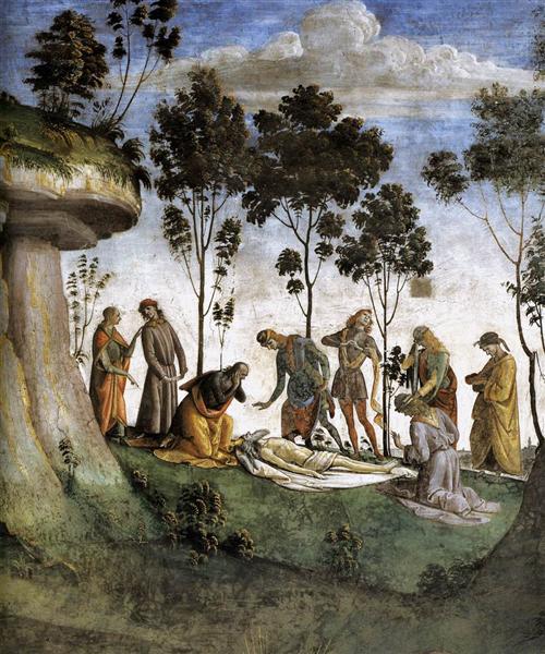
The reason why I choose Moses's Testament and Death, painted by Luca Signorelli is because of the look and story being told in this painting. It is a piece of history when studying the bible and people can look to this when gathering more information about the book. I was also drawn in to the detail in the grass and environmental background in the painting. Signorelli also does a great job in added detail in the characters of the painting so you can see who specifically is in the painting

Wednesday, February 12, 2020
Subscribe to:
Comments (Atom)