
Wednesday, January 29, 2020
Degas and neutral colors
Mary Cassatt

The reason why I chose Mary Cassatt’s artwork, “Maternal Caress” is because of the emotions given off in this piece. I love the genuine love that is shown from the mother and daughter. I also really love the color tones and detail within this painting. This piece showed me that art can always have a powerful theme/emotion driven behind the artist reason to create. I feel that a bunch of other Mary Cassatt’s artworks pay high attention to human-like features/emotions within her paintings. That is why I was strongly attracted to this piece.
Franz Marc

The Drowning Girl by Roy Liechtenstein
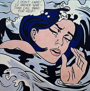
The Drowning Girl by Roy Liechtenstein
This is a painting done by Roy Liechtenstein in 1963. It is one of Liechtenstein's most well known works, and one of the most representative paintings of the pop art movement. It is known as The Drowning Girl and was derived from a 1962 DC comic. It can now be found at the Museum of Modern Art. Liechtenstein takes a work of art that is not meant to be this dramatic but is able to create a sense that the woman is in emotional distress and would rather die than ask a man named Brad for help. The artist was able to give this same effect with many of his paintings. He changes the meaning to what he wants it to be to create something completely different.
Art by CY Twombly

The art piece titled, “Blackboard Painting,”
was created in 1970, by the American artist CY Twonbly. To
create this art piece, Twonbly used white wax crayon, over a dark gray
background. This background allowed for the four lines of exuberant scrawls
completed by wax crayon to stand out to the observer.
The primary reason I was drawn to this work of art, was because it reminded me of cursive writing. This type of writing in itself can be thought of a work of art and is often under appreciated. The picture made me reminisce of learning script trying in my youth, where I was made to write the letter L consecutively by my preschool school teacher.
I was surprised to find out that this art piece price was estimated between "$35 to $55 million". To me, the simplicity of the drawing did not match the estimated listing price. At the same time, it made me realize that art does not have to be complicated for someone to appreciate it. However, it made me also come to understand that anyone can be an artist, if the passion and drive fuels their creative endeavors to express themselves or make a statement. Because of this, an artist does not need to draw perfect lines, circles or shapes to make good art.
Jay McClellan

Edgar Degas

I chose this piece of art, "Dancer Stretching" by Edgar Degas (c.1882-1885) because I personally love to draw portraits and figure drawings. Degas uses pastel on medium pale blue paper. The medium that Degas uses creates a soft yet sharp portrait of a dancer. This piece captured my eye because of the dancer's expression. She appears to be distressed during a time where she "should" appear graceful and content. I am planning on using graphite pencil and charcoal as an alternative medium to create a portraits and figure drawings of my own.
Wayne Thiebaud

Tuesday, January 28, 2020
Oskar Kokoschka
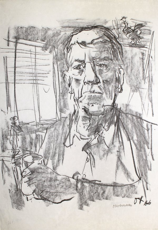
Selbstbildnis Mit Statuette or, self portrait with statuette, pictured above is one of many of Oskar Kokoschka’s portraits. Kokoschka was born in 1886 and grew up in Vienna on the cusp of the German Expressionist art movement. As an Expressionist, Kokoschka’s approach to portraiture was driven by emotion. While this piece isn’t the most expressive of his works there is still a great deal of emotion within it, this is most notable in the eyes, which are rather tired and solemn. His eyelids are very heavy, giving him an almost empty glare. This tiredness shows his age since by the time he made this piece in 1966, he was nearly 80. Rather than creating depth with an extensive grayscale, Kokoschka uses large areas of shade and light, and on top places contour lines to provide definition. Instead of creating realism through detail, Kokoschka leaves many parts of the portrait up to suggestion; such as, his hand which is clearly recognizable even though there is very little distinctions made. I chose this piece because I admire Kokoschka’s command over shade and light and his confidence in the placement of his contour lines, something which I’d like to replicate in my own work.
Paul Cezanne

This piece of art is called "Mont Sainte-Victoire with Large Pine" and it was created in 1887 by the artist Paul Cezanne. Cezanne was a French artist who formed the bridge between impressionism and cubism. What drew me to this painting was the use of color as well as the detail in the mountains. I also was interested in the brushstrokes he used to create the tree. From afar, the tree looks very smooth and wispy, but when you look closer, you can see the multiple different brushstrokes he used to create that effect. I was also able to see the building on of color as he progressed in making this painting. The main thing that fascinated me about this painting was the difference in how it looks from afar versus from up close.
David Hockney

This artwork is called "Pearblossom Hwy" created by David Hockney. This work was created using chromogenic print. I really enjoyed looking at this art because it gives the viewer a sense of movement even though all the pictures are obviously still. I chose this piece because I am planning on doing my projects based on something similar with layering different images on top of others and drawing them using colored pencil. For David Hockney, he created this image with the idea of portraying the idea of people viewing things differently even when they are looking at the same thing which I found very interesting to try and capture.
Rembrandt
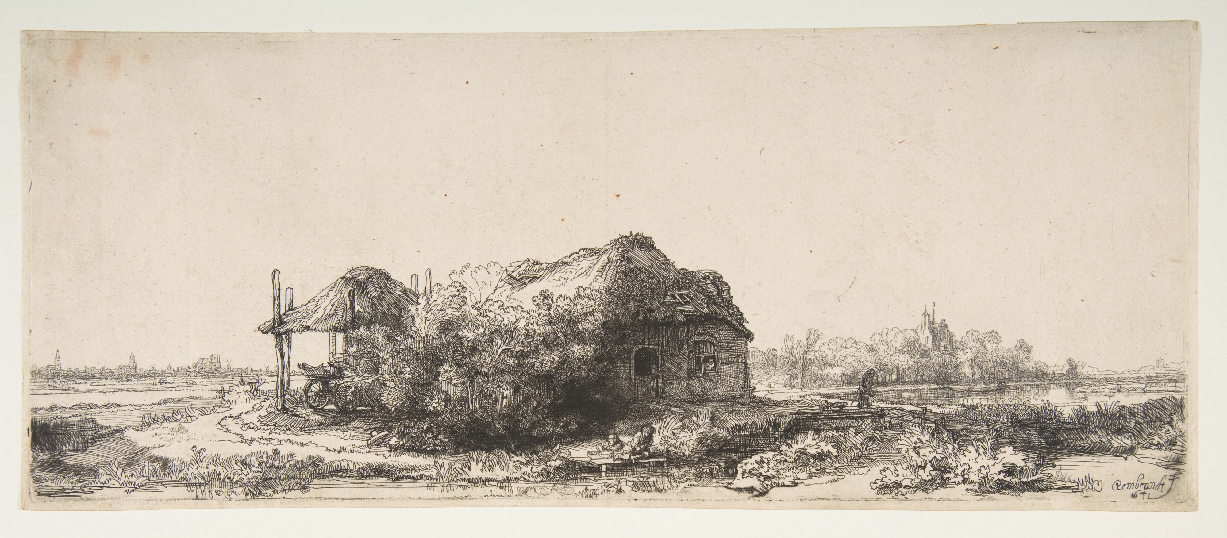
This etching is called Landscape with Cottages and a Haybarn. This was created by Rembrandt in 1641. The linework in this etching is so detailed, and I am in awe with the fact that he created this piece which such steady hands. When I first saw this piece I thought the person standing on the edge was all alone, but then when you look very closely near the house area there seem to be two people staying inside the house. I find it so cool that even though these people have no facial features you can still tell that those lines in the house are people. What’s even more fascinating is that those lines could’ve easily blended in with the house but Rembrandt was able to make the lines that make up the people stand out through tight or spaced lines.
Tim White

Mary Cassett

This work of art is titled The Long Gloves. Before knowing the title of this work I would not have known that the woman is wearing gloves which leads me to believe that the intention was to make the gloves very subtle to not take away from the rest of the drawing. The focus of this drawing is not the gloves themselves but the use of color to represent gloves. That color is then used in various other areas of the body like details in the face and neck. Although many of Mary's drawings tend to focus on the face and dring your attention to it; I find that I relate with this much more because my attention is not drawn to the face but to the work as a whole and its exploration of color. I can see myself using this drawing as a reference for my work as I want to take from the body's undertones and use more atypical colors when drawing.
Monday, January 27, 2020
Georgia O'keeffe

This piece of artwork is called Grey Line With Black, Blue, and Yellow. I decided to pick this piece of artwork because I want to do something up close and have people questioning what it is. I also really like the colors so maybe I will dabble in that as well. It looks simple yet very abstract. Ive always really admired O'Keeffe's artwork.
Wednesday, January 22, 2020
Supplies
• Pad of good drawing paper, minimum 18” x 24” in size. Strathmore, Canson, or other drawing pads are acceptable.
• One 9” x 12” sketchbook. Mark-making and other supplies:
• One each of the following drawing pencils: 6b, 2b, Hb, 2H, 4H or One complete set of pencils
- Oil Pastels
- Chalk Pastels
• Erasers: 1 Art Gum, 1 White Vinyl Pen Eraser, 1 Kneaded
• Drafting Tape or other low-adhesive tape.
• Box for supplies
Thursday, January 16, 2020
Syllabus
Mount Saint Mary College
Drawing II
Course Number: ART 3020 Credits: 3
Course Title: Drawing II
Professor: Gary Jacketti
Blog: drawing22020msmc.blogspot.com
Text
Office Hours: Monday, Wednesday before or after class
email: gjac4166@msmc.edu
Class Times: Monday, Wednesday 6:55 to 8:15
Course Outcomes: The objective of this course is to continue the development of personal expression through drawing. The course will reflect on the influences and conventions of drawing beginning with the dawn of time through Contemporary Art. The students will begin to develop personal avenues of expression using various techniques and mediums of drawing. The emphasis will be on this personal development and its impact on works in studies as well as finished drawings.
Grading and Evaluation
Students will need to complete 2 major projects. They will also present accompanying studies and intellectual research to substantiate these finished drawings. Studies from life and personal interests will be a major component of their work, therefore attendance is mandatory. Three unexcused missed classes will result in the dropping of the letter grade by 1, 5 absences the grade will be lowered by 2. I will evaluate the content as follows:
Mid-Term Drawing 30%
Blog 15%
Drawing Studies 25%
Final Drawing 30%
Division of Arts and Letters Grading Policy
Blog
You will be responsible for a weekly blog post related to your personal avenue of expression. Historical and contemporary painters should be used as influence and inspiration.
Critiques
Your finished major drawings will be looked at and discussed critically with your peers. Attendance and participation is mandatory. This is one of the most important tools artists use to help reflect and improve their work. I will be available for one private critique for each project to be scheduled during the semester.
Drawing Studies
These studies will consume a great amount of studio time during the semester. They will be used to improve technique and as a guide through experimentation and exploration. They should show a cohesive and substantial thought process and become more directly integrated to the 2 major painting projects.
Mid Term and Final Drawings
These drawings are complex and take a great amount of time to develop. They will be worked on during the semester on a continual basis. The growth of the individual will be evident in their creative endeavors.
Week 6 and 7
Group Critiques for midterm drawing
Week 8
Mid Term Critique
Week 13 and 14
Group Critiques for final drawing
Week 15
Final Critique
Subscribe to:
Comments (Atom)